Smart Strategies for Deploying Digital Signage
A Q&A with Adrenaline’s banking digital signage experts
Digital signage at a glance:
- More than 90% of financial institutions have deployed digital signage in at least one of their branches.
- In the hub-and-spoke model, digital signage helps create dynamic spaces in the hubs.
- Digital signage solutions must be visually effective, cost effective and operationally effective.
- Use customer data and community demographic data to target messaging more effectively and tailor it to the community and customer base.
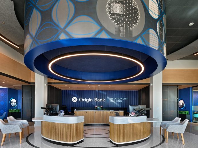
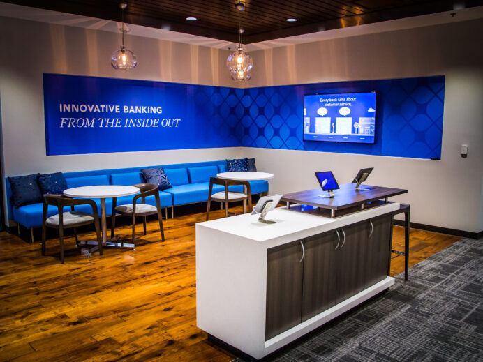
Digital signage is making its mark in banking, with 90% of financial institutions deploying the displays in at least one of their retail branches. Knowing about the latest trends and technology is important, but what’s even more essential is understanding the strategy behind these brand beacons in the branch environment.
To learn more about best practices in digital signage and what banking leaders should know before making investments, we referred to a recent Q&A article in the ABA Banking Journal. In the article, Adrenaline’s digital signage experts Jerry Reese and Rick Barrick were interviewed about one of the company’s high-profile digital deployments and shared their insights on what makes signage successful.
What are some trends in all signage for banks and credit unions?
Rick Barrick: In banking where so many branch networks use the hub-and-spoke model, one of the keys to success is creating dynamic spaces in the hubs, where banks have great expertise and offerings, including in commercial banking, small business, wealth management, etc. These larger full-service branches are often found in urban areas where the population density is high.
When you start to strategize how you physically treat the space in these high-opportunity areas, the branch really becomes a media channel to engage more passers-by, either from a pedestrian or automobile perspective. Signage like what Valley Bank installed in their 5th Avenue Flagship allows them to drive a higher number of gross impressions and deliver greater ROI for that branch.
Jerry Reese: I would add that effective deployment requires deep knowledge of tailored technologies that will bring the creative to life. As a client partner, one of our primary responsibilities is to provide clients with these unique options from a technology or display standpoint to execute on these concepts. These signage solutions must be visually effective, cost effective and operationally effective. So it’s not just the design and the concepts that matter, but the physical and technical decisions that go with them that makes a successful signage strategy.
What are the best ways to optimize the footprint for signage?
Rick Barrick: Activating the attract zone in an urban setting allows banks to create a mood, tell a story and start to draw people in to a branded experience. In high traffic areas, banks can influence prospects and start to establish the brand. We work with financial institutions to map the right message to dwell times when pedestrians or drivers are at traffic lights, enabling signage to tell a story that connects emotionally and puts the brand in a better position in the consideration set for a primary banking relationship.
The best signage uses a hierarchy of messaging. At the top is a dominant brand perspective that has broad scale and gets smaller at a more human eye level. We also use a combination of first surface and second surface, sometimes putting signage right up against the glass, whether it’s digital or a static vinyl application. Further back, the digital is a canvas where primary and secondary brand colors interact and become a dynamic, motion-filled backdrop. Like with Valley Bank, these kinds of multi-level, multi-layered textures represent some of most impactful signs.
You mentioned messaging hierarchy. What is the right messaging for the medium?
Rick Barrick: Larger scale signage is at the top of the messaging hierarchy, acting as master signage. It’s like a mood ring for the brand and a way to artfully reflect your place in the community and the seasons in the area, etc. These signs tie in visuals of the master brand and weave them into the fabric of place to make connections with people in the market.
When digital signs are first deployed, they’re often new to the market and make a big bold brand statement. The signage represents a declarative position that ‘we’re here to stay’ or that ‘we belong in the community’ but delivers that message in a creative, more human and emotive way. It’s done visually and viscerally to evoke an emotional response. Signage like this is a much quicker way to connect emotionally than anything that’s a more literal, verbal interpretation of the brand.
Also an intentional part of the overall branch design, Valley Bank’s digital signage leverages the exterior glass as a way to shine a spotlight on the brand. But, these large master brand experiences are meant to be viewed from afar, in a way that when you see it, even just fleetingly for a few seconds, it connects through that visual experience. That’s how we design it technically, creatively and programmatically.
Jerry Reese: One of the things I think doesn’t often get enough consideration is the medium through which the brand attributes are communicated. By that I mean if what you’re trying to convey is a modern tech-savvy brand, the medium through which that message gets communicated in the branch should not be a detraction. Using a very old digital display, for example, doesn’t tell your customers that you’re a modern, forward-thinking, tech-savvy bank. So, we guide our clients to be mindful of not only the message itself, but also the medium, and to keep that consistent with what the brand wants to communicate and what the customer experiences in other brand channels, as well.
How can banks make better use of their signage?
Jerry Reese: I would say one thing that we see consistently as an area of improvement across banks of all sizes is that they tend to take a one-size-fits-all approach to branch messaging. When everything has the same consistent message regardless of the area, it doesn’t take into account anything specific about the variations in the audience or the customer demographics of that branch.
So, one of the things that we guide clients to do is to leverage information – customer data, community demographic data – as a baseline to target messaging more effectively. That customization allows banks to deliver messaging, whether it’s static or digital, in a way that is more tailored to the specific branch in the community and the customer base that it serves.
This more strategic approach to signage lets banks leverage the tools and technologies to create a more powerful communication channel with their customers.
To learn more about digital signage display strategies or to speak with one of our retail digital signage experts, contact Adrenaline today. And be sure to stay tuned in to the Believe in Banking Podcast as it highlights industry news and views for banking leaders.
Adrenaline is an end-to-end brand experience company serving the financial industry. We move brands and businesses ahead by delivering on every aspect of their experience across digital and physical channels, from strategy through implementation. Our multi-disciplinary team works with leadership to advise on purpose, position, culture, and retail growth strategies. We create brands people love and engage audiences from employees to customers with story-led design and insights-driven marketing; and we design and build transformative brand experiences across branch networks, leading the construction and implementation of physical spaces that drive business advantage and make the brand experience real.


